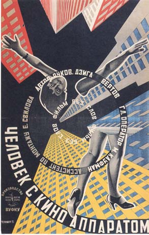
Russian Suprematism and Constructivism
When Kauffer and Cassandre were applying synthetic cubisim’s planes to the poster in England and France, a formal typographic approach to graphic design emerged in Holland and Russia. Visual Art could move beyond the threshold of pictorial imagery into the invention of pure form.
In the early 20th century Russia was torn by WW1 and the Russian Revolution, during which Czar Nicholas the 2nd (1868-1918) was overthrown. The Red Army of the Bolsheviks emerged victorious by 1920. In the midst of political trauma, a brief flowering of creative art in Russia had an international influence on twentieth century graphic design. Beginning with Marinetti’s Russian lectures, the decade saw Russians absorb cubism and futurism. Symbolically, the Russian futurist books were a reaction against the values of Czarist Russia. The Handmade additions expressed the poverty of peasant society as well as the meager resources of the artists and writers.

Illya Zdanevich, insert cover of Milliork,
by Aleksei Kruchenykh, 1919
Kasimir Malevich founded a painting style of basic forms and pure color that he called Suprematism, which is a style of abstraction that was new and totally nonobjective.

Kasimir Malevich, Black Square , c.1913.
A new vision for visual art is as far removed as possible from the world
of natural forms and apperances.

Kasimir Malevich, Suprematist Composition, 1915.
A symphonic arrangement of elemental shapes of
luminous color on a white field
becomes a expression of pure feeling.
Through the accelerating Russian movement, art was given a revolutionary social role rarely assigned to it. In 1917, energies were turned to a massive propaganda effort in support of revolutionaries and by 1920 a deep ideological split developed concerning the role of the artist in the new communist state. Malevich and Kandinsky rejected a social and political role, believing the sole aim of art is to realize perceptions of the world by inventing forms in space and time. Constructivists called on the artists to stop producing useless things because “such work now belongs to the duty of the artist as a citizen of the community who is clearing the field of the old rubbish in preparation for the new life.” During the 1920’s the Soviet government offered official encouragement to the new Russian art.
In an attempt to formulate constructivist ideology, Aleksei Gan wrote that Tectonics, texture, and construction were the three principles of constructivism. Tectonics represented the unification of communist ideology with visual form; texture referred to the nature of the materials and how they are used in industrial production and constructivism symbolized the creative process and the search for laws of visual organization.
El (Lazar Markovich) Lissitzky, who studied architecture, realized constructivist ideals. This vision influenced the course of graphic design. The mathematical and structural properties of architecture formed the basis of his art. Lissitzky developed a painting style called PROUNS (projects for the establishment of a new art). PROUNS introduced 3D illusions that both exceeded behind the picture plane (negative depth) and projected forwards from the picture plane (positive depth.) Lissitzky called Prouns “an interchange station between painting and architecture”. The synthesis of architectural concepts describes how PROUNS pointed the way to the application of modern painting concepts of form and space to applied design. This is seen in his 1919 poster “Beat the Whites with the Red Wedge”. The Space is dynamically divided into white and black areas wherein suprematism design elements transformed into political symbolism. A red wedge slashing into a white circle symbolizes support for the “red” Bolshevik against the “white” forces of Kerenski.

El Lissitzky, Beat the Whites with the Red Wedge, 1919.
The Bolshevik army emblem, a red wedge, slashes diagonally
into a white sphere signifying A. F. Kerensky’s “white” forces. The slogan’s
four words are placed to reinforce the dynamic movement.
Lissitzky saw Russian Revolution as a new beginning for mankind. Communism and social engineering created a new order where technology would provide for society’s needs and the artist/designer would forge a unity between art and technology by constructing a new world of objects to provide mankind with a richer society and environment. This Idealism led him to put increasing emphasis on graphic design, as he moved from private aesthetic experience into the mainstream of communal life. Access to excellent German printing facilities enabled Lissitzky’s graphic ideas to develop rapidly. His energy and range of experimentation with photomontage, printmaking, graphic design, and painting enabled him to become the main medium through which supremacist and constructivist ideas flowed into Western Europe.
Lissitzky joined editor Llya Ehrenburg in creating the trilingual journal called Veshch (Object.) The title was chosen because the editors believed that art meant the creation of new objects. Lissitzky and Ehrenburg realized that parallel yet isolated art and design movements had evolved during the seven-year period of separation when Europe and Russia were bled by revolution and war. They perceived Veshch as a meeting point for new works from different nations. The first cover shows how Lissitzky constructed his designs on a dynamic diagonal axis with asymmetrical balancing of elements and weight placed high on the page. It also showcased Lissitzky’s practice of making layouts on graph paper.

El Lissitzky, Layout for a Broom cover , vol.5, no.3 , 1922.
Isometric perspective letterforms are upside down and backward
in the second title presentation, achieving a subtle vitality i
n a rigorously symmetrical design.
Rebelling against the constraints of metal typesetting, Lissitzky often used drafting instrumental construction and paste up to achieve his designs. Lissitzky did not decorate his books; he constructed it by visually programming the total object. He designed exclusively with elements from the metal type case.

El Lissitzky, cover of For the Voice, by Mayakovsky, 1923.
In contrast to the Veshch cover, constructed
on a diagonal axis, here a rigid right angle is animated by the c
ounterbalance of the M and circles.

El Lissitzky, pages from For the Voice, by Mayakovsky, 1923.
The poem “Our March” begins, “Beat your drums on the squares of the riots, turned red
with the blood of revolution.” The title type has staccato cadences of a drumbeat;
the red square signifies the blood-stained town squares.

El Lissitzky, pages from For the Voice, by Mayakovsky, 1923.
The poem title “Order for the Army of the Arts” appears on the right page
opposite a dynamic constructivist design.
His ultimate intent was for type to compliment the poems as “a violin accompanies a piano”. Each poem’s title spread is illustrated with abstract elements signifying its content. Spatial composition, contrast between elements, the relationship of forms to the negative space of the page and the understanding of such printing possibilities as overlapping color were important in Lizzitsky’ss work.

El Lissitzky, book cover for The Isms of Art, 1924.
Complex typographic information is organized into a cohesive
whole by the construction of structural relationships.
Lissitzky’s book format for The Isms of Art was an important step toward the creation of a visual program for organizing information.The three-column horizontal grid structure used for the title page and the three-column vertical grid structure utilized for the text.

El Lissitzky, text format for The Isms of Art, 1924.
Rigorous verticals separate German, French, and English texts,
and horizontal bars emphasize an important introductory quotation.
The two-column structure of the contents page became an architectural framework for organizing the forty-eight page pictorially illustrated portfolio. Asymmetrical balance, silhouette halftones and a skillful use of white space are other important design considerations. By using large, bold san-serif numbers to link the pictures to captions, Lissitzky allows these numbers to become compositional elements. This treatment of san-serif typography and bold rules is an early expression of the modernist aesthetic.
Lissitzky utilized montage and photomontage for complex communications messages. On a poster for a Russian exhibition in Switzerland, the image gives equal position to the female and the male. This was a significant symbolic communication in a traditionally male dominated society. Lissitzky spent increasing amounts of time with large exhibition projects for the Soviet government, art direction and some architectural design projects. Due to his social responsibility and commitment to his people, his mastery of technology to serve his goals, and his creative vision, El Lissitzky set a standard of excellence for the designer. He was one of the great pioneers and his indirect influence was widespread and enduring.

El Lissitzky, exhibition poster, 1929.
In this stark, powerful image, the youth of a collective society are cloned
into an anonymous double-portrait above the exhibition
structure designed by Lissitzky.
Alexander Rodchenko was an ardent communist who brought an inventive spirit and willingness to the experiment of typography, montage and photography. His early interest in descriptive geometry lent an analytical precision and definition of form to his paintings. In 1921 he abandoned painting and turned to visual communication because his social views called for a sense of responsibility to society instead of personal expression. Collaborating with writer Mayakovsky, he produced page designs with strong geometric construction, large areas of pure color, and concise, legible lettering. His heavy sans-serif hand lettering provoked the bold san-serif types.

(From Left)
Alexandre Rodchenko , cover for lef, no.1 , 1923.
The logo is printed in tight registration, with the top half of the letter forms red
And the bottom half black
Alexandre Rodchenko , cover for lef, no.2 , 1923.
In this early photomontage , a cross out over printing
The montage negates the old order ; young
Children symbolize the new society.
Alexandre Rodchenko , cover for lef, no.3 , 1923.
A biplane baring the magazine logo
Drops a fountain pen bomb at a gorilla representing the
Traditional arts of the czarist regime.
In 1923 Rodchenko designed a magazine for all fields of creative arts, entitled Lef . A design style based on strong static horizontal and vertical forms placed in machine-rhythm relationships emerged through the publications of this magazine. Overprinting, perfect registration and photomontage were regularly employed in Novyi lef . Rodchenko delighted in contrasting bold, blocky type and hard-edged shapes against the softer forms and edges of photomontages. His interest in photomontage was a conscious effort to innovate an illustration technique appropriate to the twentieth century.
Beginning of Russian photomontage coincided with the development of montage in film, and shared some of its vocabulary. Common techniques included showing simultaneous action; superimposing images; using extreme close –ups and perspective images, often together; and rhythmically repeating an image. The concept of serial painting, which is a series or sequence of independent works unified by common elements or an under lying structure, was applied to graphic design by Rodchenko.As seen in works of Salomon Telingater, a dash of Dadaist vitality was often mixed into constructivist designs.
Georgii and Vladimir Augustovich Stenberg were talented brothers who collaborated on theatrical designs and film posters. Mindful of the reproduction difficulties with photographs, they made meticulously realistic drawings for their posters by enlarging film-frame images via projection and grid methods. These 3D illusions were contrasted with flat forms of bright color in dynamic, well-designed posters conveying strong, direct messages.
Georgy and Vladimir Augustovich Stenberg, film poster, Undated.
Spatial dislocation is achieved by extreme perspective,
Circular type, and the fragmented figure.
Georgy and Vladimir Augustovich Stenberg
“The Eleventh Year of the Revolution,” poster
1928
The master of propaganda photomontage was Gustav Klutsis, who referred to the medium as “the art construction for socialism”. Employing monumental and heroic images, Klutsis used the poster as a means for praising Soviet accomplishments. His work has often been compared to John Heartfield’s powerful political statements. Klutsis believed that photomontage was the medium of the future and that it had rendered all other forms of artistic realism obsolete. Although most of posters celebrated the achievements of Stalin, Klutsis’s uncompromising avant-garde approach eventually caused him to be arrested in 1938 during the Stalinist purges. He perished in the labour camps in 1944.
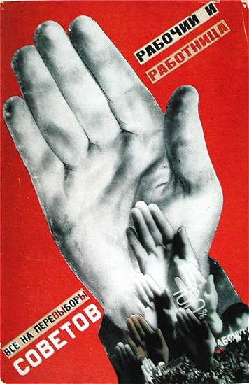
Gustav Klutsis, “Everyone must vote in the election of Soviets” Series, Poster , 1913

Gustav Klutsis, “Building socialism under the banner of Lenin, “ poster, 1931
Another Soviet artist associated with Tatlin, and the constructivists, who profoundly influenced Russian modernism was Vladimir Vasilevich Lebedev. He embraced Bolshevism and designed bold, flat, neoprimitivist agitational propaganda posters for ROSTA, the Soviet telegraph agency. Due to learning to to simplify, to reduce forms to their basic geometric shapes and use only brilliant primary colors and to tell a story visually and in sequence, Lebedev’s work proved to be an excellent preparation for designing picture books for boys and girls. He explained that, in the twenties, they fought for mastery and purity of art. He said that they wanted fine art to be descriptive, not illustrative and that Cubism gave them discipline of thought, without which there is neither mastery nor purity of professional language. With they growth of the Soviet children’s book industry under Lenin’s New economic policy, Lebedev became the father of the twentieth- century Russian picture book.

Vladimir Vasilevich Lebedev, book spread, Tsirk (Circus), 1928.
Often in collaboration with the poet Samuil Marshak, Lebedev devised a flexible, modernist shorthand for figures that he reduced to their simplest shapes against a vast white background and relieved only by bright, flat harmonious color and some contrasting texture. He cultivated “infantilism “ in his work by borrowing the fresh, spontaneous, naïve techniques of children’s art. HE stated that when he makes drawings for children he tries to recall his own consciousness as a child. He was also extraordinarily inventive with various typefaces. Lebedev, more than anyone else, brought the picture book up to date.
Freeing his designs of any gratuitous detail, Lebedev illustrated little Marxist parables on the superiority of the Soviet system to capitalism. Lebedev was always an agitational propagandist at heart. He defined a good communist doesn’t deny the necessity if an individual approach to illustrations. The more the artist shows his personality in his work, the more effective will his art be, the deeper it will influence the reader, the closer it will bring him to art.
During the years following the 1917 revolution, the Soviet government tolerated advanced art, but by 1922 having turned hostile , it accused experimental artists of “ capitalist cosmopolitanism” and advocated social-realist painting. Constructivism lingered as an influence in Soviet graphic and industrial design. Painters like Malevich who did not leave the country drifted into poverty and obscurity and many other artists vanished into the gulag. This artistic1 movement underwent further development in the West, and innovative graphic design in the constructivist tradition continued through the 1920’s and beyond.


Comments
Post a Comment