De Stijl
This movement was launched in the Netherlands. Painters Piet Mondrian joined its founder and guiding spirit, Theo van Doesburg. Working in an abstract geometric style , he sought universal laws of equilibrium and harmony for art, which could then be a prototype for a new social order. Mondrian’s paintings are the wellspring from which De Stijl’s philosophy and visual forms developed. He rid his art of all representative elements and moved cubism toward a pure, geometric abstraction.
M.H.J. Schoenmakers, who decisively influenced Mondrian’s thinking, defined the horizontal and the vertical as the two fundamental opposites shaping our world, and called yellow, blue and red the three principal colors. Mondrian began to paint purely abstract paintings composed of horizontal and vertical lines. This was the evolution of abstraction towards its ultimate goal - the expression of pure reality. He believed that true reality in visual art “is attained through dynamic movement in equilibrium…. Established through the balance of unequal but equivalent opposites. The clarification of equilibrium through plastic art is of great importance for humanity…it is the task of art to express a clear vision of reality.
All together, Mondrian, Van Der Leck and Van Doesburg, reduced their visual vocabulary to the use of primary colors (red, yellow and blue) with neutrals (black, gray and white), straight horizontal lines and vertical lines, and flat planes limited to rectangles and squares. De Stijl artists sought an expression of the mathematical structure of the universe and the universal harmony of nature. They were deeply concerned with the spiritual and intellectual climate of their time and wished to express the “general consciousness of their age.” De Stijl sought the universal laws that govern visible reality but are hidden by the outward appearance of things. Scientific theory, mechanical production and the rhythms of the modern city formed from these universal laws.

Théo van Doesburg and Laszlo Moholy-Nagy, book cover, 1925.
The essence of de Stijl is conveyed.
De Stijl believed beauty arose from the absolute purity of the work. They sought to purify art by banning naturalistic representation, external values and subjective expression. The content of their work was to be universal harmony, the order that pervades the universe. The implications for modern design proved to be immense. De Stijl advocated the absorption of pure art by applied art. The spirit of art could then infuse society through architecture, product and graphic design. Under this system, art would not be subjugated to the level of the everyday object; the everyday object would be elevated to the level of art. De Stijl became a natural vehicle for expressing the movement’s principles in graphic design.
Van Doesburg applied De Stijl principles to architecture, sculpture and typography. In the designs of alphabets and posters, he applied horizontal and vertical structure to letterforms, and the overall layout. Curved lines were eliminated and san- serif typefaces were favored. Type was composed in tight rectangular blocks. The square was used as a rigorous module for letterform design. A harmony of form was achieved, but banishing curved and diagonal lines diminished character uniqueness and legibility. Asymmetrically balanced layouts were composed on an open implied grid. Color was used not as an afterthought or decoration but as an important structural element. Red was favored as a second color in printing because, in addition to its graphic power to compete with black, it signified revolution.
Comprehended the liberating potential of Dada, Van Doesburg invited Kurt Schwitters to Holland to campaign for it. They collaborated on typographic design projects and Van Doesburg explored Dada typography and poetry. He saw Dada and De Stijl as opposite but complementary movements. He believed that Dada could destroy the old order, then De Stijl could build a new order on the razed site of prewar culture.
In architectural experiments, Van Doesburg constructed planes in space with dynamic asymmetrical relationships. His De Stijl architectural theory was realized in 1924 when Gerrit Rietveld designed the celebrated Schroeder House in Utrecht. This house was so radical that neighbors threw rocks. The following year, Oud designed the Café de Unie with an asymmetrical façade, projecting De Stijl’s vision of order on an environmental scale.
Van Doesburg, with his phenomenal energy and wide ranging creativity, was De Stijl. De Stijl. as an organized movement, did not survive his death. Others, like Bart van der Leck, continued to use its visual vocabulary for many years. This could be seen in his open compositions of forms constructed of horizontal, vertical and diagonal lines and shapes separated by spatial intervals found in works ranging from early posters to book designs and illustrations.

Bart van der Leck , layout for a batavier line poster, 1915-16.
In a series of preliminary layouts, Van der Leck struggled to bring order
To the design by dividing the space into rectangles.
In 1918 Dutch architect, H.T. Wijdeveld initiated the publishing of the magazine Wendingen. It started as a monthly publication devoted to architecture, construction, and ornamentation and
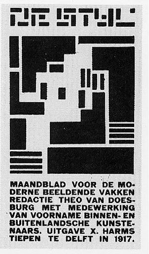
Vilmos Huszár, cover design for De Stijl, 1917.
Huszár combined his composition with type and Van Doesburg’s
logo to create a concise rectangle in the center of the page.
logo to create a concise rectangle in the center of the page.
represented all sectors of the visual arts. Wijdeveld constructed his letters from existing typographic material and used the same technique in his Wendingen covers, stationery designs, and posters. In the design of the Wendingen pages, Wijdeveld used solid and heavy borders constructed from right angles, typographic counterparts to the brick architecture of the Amsterdam School. Wijdeveld contributed only four Wendingen covers, and others were designed by various architects, sculptors, painters and designers.

Vilmos Huszár, title pages for DeStijl,1918.
Huszár presented a posistive/ negative figure/ ground study in spatial
Relationships. Restrained typography marked Apollinaire’s death.

Théo van Doesburg, cover for De Stijl, 1922.
Type is asymmetrically balanced in the four corners of an implied rectangle. De Stijl is combined with the letters N and B, which indicated Nieuwe Beelden (New Images).


Comments
Post a Comment